


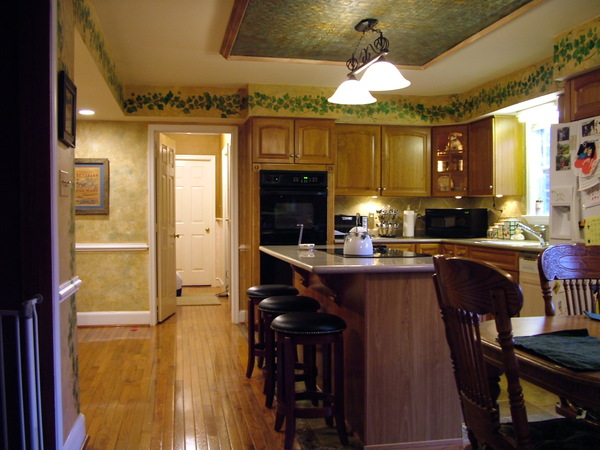
A kitchen ceiling features embossed wallpaper. COURTESY JOHN KIERNAN
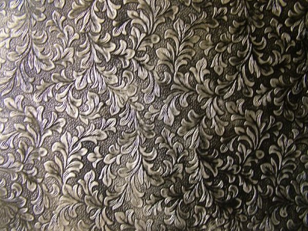
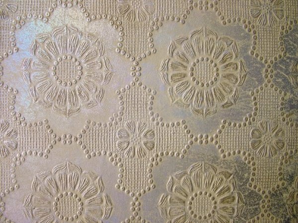
These embossed wall paper coverings can be used as accents or to cover entire walls. COURTESY JOHN KIERNAN
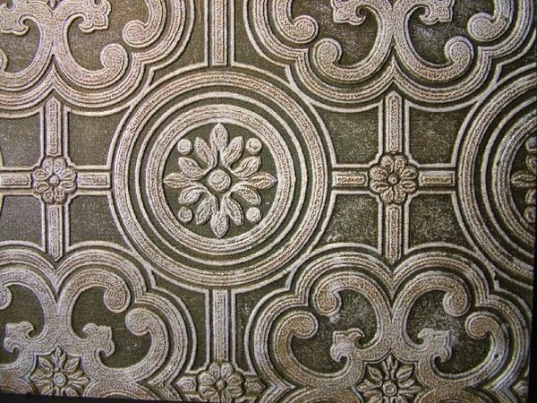
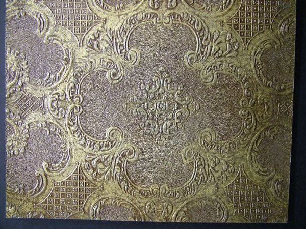
These embossed wall paper coverings can be used as accents or to cover entire walls. COURTESY JOHN KIERNAN
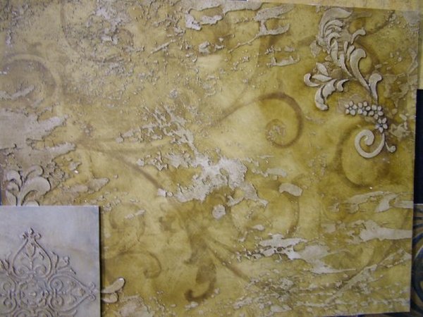
Hand-painted wallpaper. COURTESY JOHN KIERNAN
When it comes to the fashion industry, for the last few years it’s been out with the 21st century and in with the 1970s—particularly the jumpsuits, wide-brimmed floppy hats, flared pants and maxi dresses in the loud, retro flowery prints that went along with it.
And the same can be said about wall coverings. Believe it or not, wallpaper is making a comeback from the 1970s and ’80s, and in a big way. These days, more than ever, wallpaper is colorful, complex, contemporary and, on the high-end market, even one-of-a-kind.
Recently, Residence caught up with a few East End interior designers—Westhampton Beach-based Patrisha Hyman, Dream Windows & Interiors owner Diane Bianchini in Westhampton, and John Kiernan, who just opened up shop at Blue Line Studios in Southampton last fall—about the latest trends and popular choices in the world of wallpaper.
“As far as I’m concerned, it’s the only way to go,” Ms. Hyman said of wallpaper during a recent telephone interview. “It’s a mistake not to put wallpaper in a room. It changes the space. It really does.”
But watch out. Wallpaper trends and patterns have changed dramatically since the ’70s, and many have been dubbed passé, the designers all warned.
“Really, really bold colors are out,” Ms. Bianchini said. “Little teeny, tiny floral prints, not anymore. People used to do borders. Gone. They used to cover the light switches and the molding. That’s definitely out. Nobody does that anymore.”
And if Ms. Hyman, whose customers call her “The Wallpaper Queen,” never saw the rust green and gold wallpaper color palette again, she said she’d be thrilled.
“I must tell you what I think is really out: the ‘grandma’ look,” she added. “What is it? It’s when you look at something and say, ‘That looks like it came from my grandmother’s house.’ Heavy, dark, traditional. I’m not saying I love real stark, cold, modern. I don’t, but contemporary can be very warm and a mix.”
Recently in Hamptons homes, Ms. Bianchini has observed a trending toward softer and lighter wall colors that are serene and nature-inspired. Sometimes, the wallpapers incorporate prints of leaves, branches and large floral designs, she said, though she’s had several requests for “Hollywood Glam” and “Glitz and Glam,” which is paper embellished with glitter, beads and iridescents.
But above all, texture is in, Ms. Hyman said. And in wallpaper terms, that means grasscloth.
Grasscloth colors run the gamut, from persimmon to charcoal gray and silver tones, which are very popular right now, Ms. Hyman said. The designers recommend using grasscloth in libraries, dens and living rooms. A single roll ranges from $125 to $225, and are sold by the double roll. One yard can cost $80 to $90.
But Ms. Hyman cautioned those who are thinking about covering their walls with grasscloth.
“It takes a special client to appreciate grasscloth wallpaper because you can sometimes see the seams,” Ms. Hyman said. “You need a really good installer. That’s key. A lot of times, the walls need to be skim-coated. Because if the walls aren’t really flat, you’ll see imperfections in the paper. Actually, that applies to all paper, but especially grasscloth.”
A child’s bedroom is not necessarily the place for grasscloth, Ms. Hyman and Ms. Bianchini pointed out. For kids’ rooms, Ms. Hyman prefers stripes, Ms. Bianchini likes unique, kid-geared papers by companies such as PaperBoy Wallpaper and Farrow & Ball.
In rooms that require frequent cleanups, like kitchens and bathrooms, it’s wise to employ a vinyl-coated wallpaper, the designers agreed.
“How many times does someone throw something out and spaghetti splashes on the wall?” Ms. Hyman said. “You can’t watch everyone. This way, you could immediately get a sponge and wipe it off. It has a lot of texture and looks like fabric.”
Bathrooms and powder rooms are merely an excuse to go wild and splurge on wall coverings, Ms. Bianchini said. Since they are generally smaller spaces, they require less paper to create an impact, so many homeowners opt into using a more expensive covering.
And according to Mr. Kiernan, bathrooms don’t need to match the rest of the house the way a bedroom should.
“I always look at bathrooms as if you’re looking inside a jewelry box,” he said. “It’s like, ‘Wow!’ It holds itself. You can be a lot more bold. We’ve even done wallpaper on the ceiling in bathrooms.”
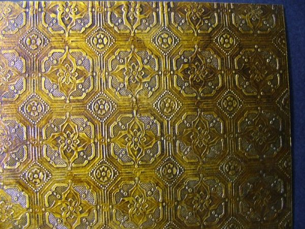
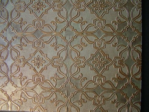
Mr. Kiernan, who is based in Washington, D.C. and opened up shop on Hampton Road in October, said the grasscloth trend hit the Virginia area hard about four years ago. Now, metallics rule the wallpaper charts there, he said. The metallic look can be achieved with embossed wallpaper, which is generally painted, he said.
“It doesn’t look like wallpaper,” Mr. Kiernan said. “Sometimes, people swear it’s tin. It’s the embossing that creates that three-dimensional effect.”
Hand-painted wallpapers are also picking up steam in D.C., he said. They look like découpage when applied, he said, and give off an uneven look and color. That aesthetic certainly is appropriate for the East End as well, according to Mr. Kiernan.
“It has a tobacco look so it’s great for a study or man cave,” he said. “It’s a really rich look.”
While it’s possible to apply wallpaper without professional help, all of the designers warned against it. Or as Ms. Bianchini put it, “A quality wallpaper hanger is worth his weight in gold. My husband and I almost got divorced once. I’m not kidding. It was so frustrating, holding all of the wallpaper up, trying to match it up.”
She sighed. “Certain papers, like grasscloth, are very, very delicate, and if you put too much glue on it, it comes through the paper. Ask me how I know. We had to replace a whole room of paper once because the hangers were not used to using it. Make sure they know what they’re doing.”
But no matter the paper, no matter the space, there is one rule that shouldn’t be broken when it comes to making a room complete and harmonious: every wall application should complement the furniture, with every few exceptions, Mr. Kiernan emphasized.
“The walls shouldn’t say, ‘Hey, look at me,’” he said. “I’ve seen people who want to make a statement on the wall, and they’re kind of missing it. It’s put together as a nice picture. So when you walk into a room, you shouldn’t notice the walls first.”


 on Jan 30, 2012