


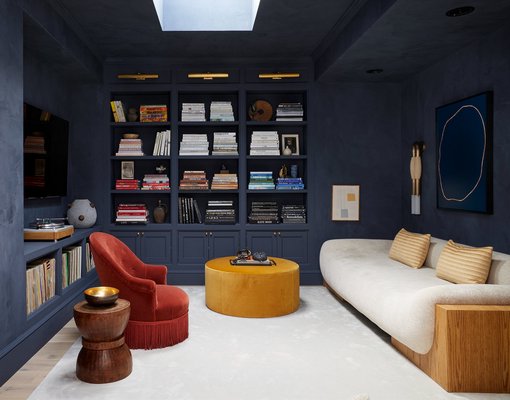
Styled by Colin King GIEVES ANDERSON/COURTESY OUT EAST
A Hamptons home styled by Colin King. TIM WILLIAMS/COURTESY OUT EAST
Rattan furniture in a space styled by Colin King. BROOKE HOLM/COURTESY OUT EAST
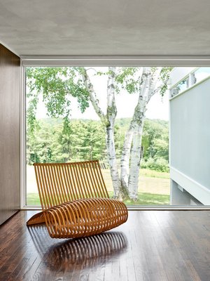
Natural wood and fiber? In.
Metallic accents and jewel-tone colors? Out.
Transitional design? On the way out.
Millennial pink? It never became a thing in the Hamptons—and there is no sign it ever will.
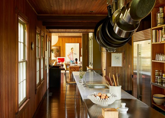
That’s all according to the 2019 Out East Design Trend Forecast, a report prepared by Zillow Group’s East End real estate listings website, Out East. The forecast is based on input from interior designers who work in the Hamptons.
Colin King, a Brooklyn-based designer and stylist who has decorated clients’ South Fork vacation homes and has styled houses for Architectural Digest and Elle Decor photo shoots, is one member of that Out East Design Panel. He said this week that he finds clients are looking for a cohesion between indoor and outdoor living areas.
“You’re just seeing more and more windows, more and more sliding doors, folding doors, pocket doors—trying to get more of the outside in,” he said.
That can include wicker and rattan furniture, jute rugs and earth-tone colors. And, Mr. King pointed out, it starts with architects ensuring sight lines from the indoors are toward treetops. “Especially out east, there is this sense of wanting to be outside even if you are inside,” he said.
He pointed to all the time that people spend indoors—more than they used to.
“Probably, I would say like 90 percent of our time is spent either in a building or a car, and then when we do venture outside, we’re so glued to our phones that we can be oblivious to the natural world sometimes,” Mr. King said.
He said that, in addition to bringing the outside in, natural fibers and earth tones can bring warmth, serenity and peace to a client’s vacation home. “It’s this beautiful balance, especially in a second home, of refinement with a casual feel,” he said. “… They don’t want clutter, but they also don’t want cold.”
And earth tones have more to offer than many realize.
“I will say, with these earth tones, I’m not saying, like, browns and creams are the only earth tones,” he said. “You can definitively see terra-cottas and those cozy reds and olive greens, and even the warmer mustard colors.”
Neutral tones may not be bold choices, but they offer flexibility that stark colors and patterned wallpapers do not afford. “People are seeing the permanence of those kinds of decisions,” Mr. King said. “When you go with a very strong, bold wallpaper, paint color, even a furniture piece, I think people tend to get sick of it quicker rather than going with a more neutral background that’s more adaptable.”
But a smaller room is easier to change up when the design becomes tired. “I always see clients being more daring in smaller spaces, whether that looks like a powder room, or a family den, a media room,” Mr. King said. “I think for the larger spaces I see a lot of subtle choices. I’m not seeing the boldness anymore.”
Something else he is seeing less of is transitional design: design where traditional and contemporary style are mixed. Mr. King attributes this to clients becoming more refined because of the time they spend scrolling through hundreds of images daily online. They are not seeking an education, but they are getting one by default when looking at Instagram, he explained. “People are getting smarter and they know what they like now.”
People are paying attention to the details, down to the doorknobs, and they are realizing what they truly like, he said. Rather than a mix of different styles, they want to have cohesion throughout their homes. “It’s exciting to see clients come to the table with a lot of ideas,” he said.
In Mr. King’s measure, a refresh or redesign does not need to come at great cost.
“I try to coin this phrase ‘aspir-tainable,’ where it’s attainable but yet aspirational, which is kind of what I try to achieve with my design,” he said. “I mean, it’s really a mix of high and low. Not everything has to be high. And, for me, there’s so many easy ways to refresh the house without spending extreme amount of money.”
Mr. King recommends small changes over time in phases—which will not only spread out the cost, but can lead to more satisfaction. “To really take the time to make smart decisions with your design, you’ll be so much happier in the long run, even if it takes a little longer,” he said.
One thing to tackle at low cost can be artwork. Carefully placing art is an easy way to update a room and bring personality, he said.
“There’s two clients: They either know exactly what kind of art they love and they have a lot of it, or there’s clients who have no direction and have no idea what kind of art they like or even how to use properly. I always say that sometimes the frame is more important than the actual art piece.”
The art doesn’t need to be expensive, he said, sharing that he’s even framed art done by his clients’ kids.
“The scale doesn’t have to be big,” he added. Small-scale art hung low can have a relationship with a piece of furniture it’s next to.
And then there’s paint. Even just a fresh coat of white paint in a room that was white to begin with. “People will be shocked by how much it can change a room,” Mr. King said.
Whites may reveal themselves to be wrong for a room, he said: too cool—gray or blue—or too warm—yellow or cream. So taking the time to find the right white will make all the difference.


 on May 28, 2019