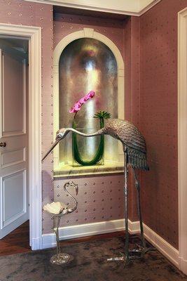
Interior designer Elsa Soyars stood in the foyer of the Pratt Estate—a nearly 7,000-square-foot Colonial Revival in Glen Cove—with a mission.She would do anything but what was expected. This traditional entryway needed some edge.
Inspired by the fashion world, Ms. Soyars dressed the space in a lavender grass cloth embellished with silver grommets, injecting a taste of rock and roll into the late 19th-century estate once built as a wedding present for Standard Oil heiress Lydia Pratt. From October 26 through December 1, her vision opened up “Home is Where the Heart is,” an inaugural Designer Showhouse benefiting the American Heart Association.
Four days after the Showhouse closed its doors, Ms. Soyars heard a surprising announcement. Color authority Pantone had just declared Radiant Orchid its Color of the Year—a purple almost identical to the grass cloth she had used in the Glen Cove mansion. And the exact hue of the flowers anchoring the two wall niches, which just so happened to be orchids.
She had called the trend before it even happened.
“Every designer, you go through moments. And I’m also a woman,” Ms. Soyars said last week from her Southampton-based studio. “And not that I find lavender or purple-y tones feminine, that’s just what I’m into. I was channeling this color. I wanted to do something that wasn’t so predictable. And there’s a certain beauty to this color. A lot of people, especially out here, they’re into grey now. But lavender goes well with that. It’s not pink. It’s sexier.”
Following the 2013 reign of emerald—a rich, vivid green that symbolized growth, renewal and prosperity seen everywhere from concept cars and cosmetics to jewelry and fashion—2014’s Color of the Year selection reaches across the color wheel with fuchsia, purple and pink undertones, and ushers in a new school of thought, according to Pantone Color Institute Executive Director Leatrice Eiseman.
This year is all about imagination, creativity, originality and confidence, she explained last week in an email, which can be an empowering presence in a complicated world.
Radiant Orchid itself represents a certain degree of complexity, Ms. Eiseman said, because it descends from both blue and red, two diametrically opposed colors, mood-wise. When they result in purple, there is a mystery attached to it, she said.
And it is not immediately obvious what the color means, she continued.
“Is [it] more calming and collected, like blue, or more exciting, like red?” Ms. Eiseman posed. “That is part of the fascination for this color. That is part of the intrigue, as well.”
Radiant Orchid has a vibrancy about it, a rosiness and a strength, according to landscape designer Roxine Brown, though she doubts it will trickle down to her industry. After all, lavenders, pinks and blues are already fixtures in horticulture—from the Fascination dahlia and Nicky phlox to Modern Pink lythrum to Angel Mist Plum angelonia, she said.
“I come from the fashion world, where Pantone was one of the major color forecasters we looked at, but I wonder how many landscape designers actually know about Pantone,” Ms. Brown, founder of Harmonia in Bridgehampton, said last week during a telephone interview. “Most people don’t even know what Pantone is. In gardens, you’re bound to the colors of the plants that are available. Maybe there will be a stronger emphasis if they’re aware of the color, like I am. It's piqued my interest. It’s gorgeous.”
Because Pantone’s announcement was just last month, Radiant Orchid’s impact will remain to be seen, as color trends can sometimes take years to gain traction, explained Hampton Designer Showhouse Producer Tony Manning last week during a telephone interview. Tangerine Tango from 2012 was huge in fashion this past year, but never quite landed in interiors.
He doesn’t believe that will be the case this time around though, he said.
In last year’s Hamptons Designer Showhouse, two rooms prematurely hinted at Pantone’s newest selection with vibrant pinks and purples mixed with popular neutrals and grays, he recalled.
“Once it gets to three, it’s a trend,” he said of the color selection used by the designers this past year. “We didn’t quite have three, but we’re on our way. This is what’s so great about showhouses. You start to see things coming in. This is a color that hasn’t been seen in a while.”
For an unconventional exotic flair, pair Radiant Orchid with different shades of blue, Pantone suggests, or add pops of the new color to neutral hues to re-energize a space. For a dramatic, sophisticated look, mix it up with sister shades of lavender, purple and pink, according to information provided by the color authority, or couple it with greens to create the feel of a tropical garden indoors.
“In all of design, to keep things fresh, people are constantly experimenting with color and accents,” Mr. Manning said. “It’s interesting that people are talking about it. And, also, it’s not a safe choice as green. It’s like how the tangerine was two years ago. Most everybody can relate to blue and green and even reds. But not everyone can relate to oranges and pinks. I think that how people will use Radiant Orchid will make it very interesting.”
This past fall, inside the Pratt Estate, Ms. Soyars said she is still unsure what came over her. She wanted the foyer to be distinguished, yet playful and soft. In the end, she knew she had only one option.
“I can’t quite explain it. It’s what I felt in my heart,” she said of the lavender hue. “When I designed this space, I wanted to walk in and feel the experience. I wanted people to be enchanted by the beauty of the combination of materials I chose and the colors. This was an old house, but I wanted to make it shine.”