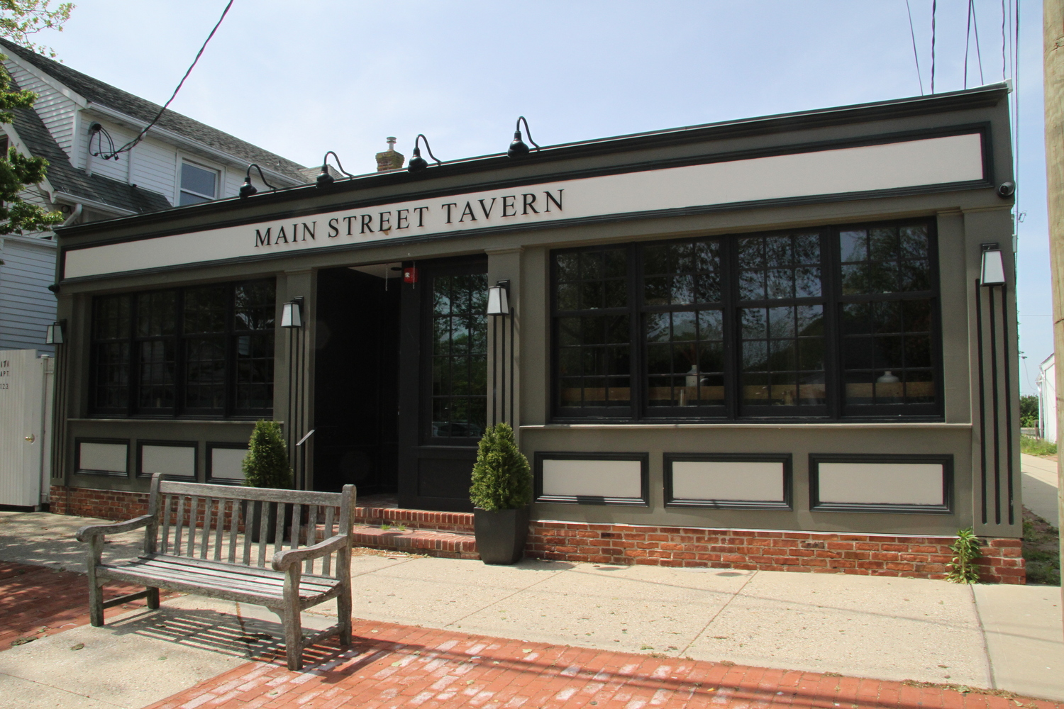
Plans to move the popular bar and restaurant Rowdy Hall have gotten bogged down in a debate with officials and some Amagansett residents over the color palate that the streetfront of the new restaurant will display.
The current Rowdy Hall building, at the back of an alley off Main Street in East Hampton Village, is black, a common color scheme for English pubs of the sort Rowdy Hall has emulated in its atmosphere and menu since it opened in 1997.
But the dark frontage has left East Hampton Town Architectural Review Board members uneasy with how the new look of the building most recently inhabited by the Main Street Tavern will fit into the overall “context” of Main Street in Amagansett.
The guidance from the town ARB has left the owners of the restaurant, which plans to relocate this fall, frustrated after repeated discussions.
An initial mock-up of the proposed design for the new Rowdy Hall facade showed a three-color frontage, with black painted wood paneling, red windows and doors, and gold lettering and trim. A side wall of the building, which runs along an alley to the municipal parking lot, was to be black.
The ARB bristled in June at the proposal, saying they preferred a less complicated color scheme and suggested paring it down to just two colors and abandoning the black alley wall.
The owners returned last week with a design for a plain black frontage, with the gold lettering over the door, dropping the black side wall.
Rowdy Hall principal Mark Smith said he would still strongly prefer the board consider allowing some red elements, even if only on the doors.
But some of the ARB members said they were still not in favor of the mostly black facade.
“I do think it’s a different color context from the Village of East Hampton — it’s a larger facade and the surrounding buildings are all white,” said Esperanza Leon, one of the ARB members. “I think the black is too strong.”
Chip Rae, another member, acknowledged the black facade has always been Rowdy’s frontage, but said that the ARB could not diverge from its mission to protect the aesthetics of the neighborhood to accommodate “branding.”
“This strikes me as a pub in London,” Rae said — Smith countering that it is indeed a look that has adorned pubs throughout history. “But it is not historic for this town. Historic maybe for England or Scotland or Ireland. That’s not where we live. We live here now. I walked the street two days ago, it’s all white and red brick. I don’t see how this fits into a historic district.”
The building is within Amagansett’s Main Street historic district but is not itself historic.
He said that the board had similarly struggled to find an acceptable look for the building when the previous owners were remaking the former Indian Wells Tavern, which boasted a primarily red frontage when it had opened.
Leon said the board saw the change in ownership as an opportunity to make the building more “compatible” with the overall look of the street, as the board’s charge in the town code dictates it should do in historic districts.
“I have no problem with it isolated — I think it’s very elegant,” Leon said of the black and gold facade. “But when I look at it within the streetscape, I don’t see it as contextual.”
Frustrated at having been sent back to the drawing board only to be told that even the modified plans were undesirable, Smith bristled at what he heard as the subjective opinion of board members that downtown Amagansett should have a nearly monotone color palate.
“So we are just going to whitewash all of Main Street?” he quipped. “That is essentially what you are saying, that everything on Main Street should be white.”
Frank Guittard, a board member, said that he did not think all of the street should have a homogeneous color palate. “There is color on Main Street — the orange at Il Buco, as well as the pizza parlor. It’s not like there’s an absence of color,” he said.
“I think maybe the black is just a little harsh,” board member Diane Benson offered. “I like the idea of dark burgundy or dark green or one of those colors.”
Board Chairwoman Kathleen Cunningham said she thought the red accents in the original scheme had actually muted the black facade and asked Smith to be patient. She said she would meet with the owners herself and help them work on further modifications toward “a lighter color palate” that her board members might find acceptable.
Smith said that changes are costly and delay the business’s preparations for its move.
“This is time and money,” he said. “If this history of this commercial building was always that it was a shade of white, I’d get it. But if you look at the history of this building, it’s been a multitude of things.”