


A color block mural, transposed from a simple hand sketched mockup to this large wall, adorns this celebrity's foyer CHRISTIAN HARDER
A blocky green gradient in an East Hampton kids' room. CHRISTIAN HARDER
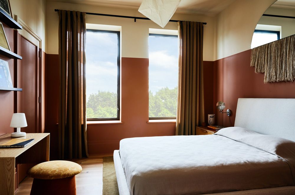
A partially painted guest bedroom. CHRISTIAN HARDER

Paint. For some, the word conjures memories of new homes, a fresh start, or for the DIYers, an invigorating weekend project. For others, indecision and fear. While a bright coat or two of matte white will probably never fully go out of style, as of late, the design world is moving away from the neutral and the safe, and toward the bright and the bold. Given the tumult these past two years, the reasons are not just understandable, but obvious. While countless strategies exist that are ready to be deployed, one standout way of painting has gained considerable ground in the recent past: breaking up flat walls with different colors, separated only by chosen lines guided by the steadiest of hands — or the bluest of tapes. In other words, color blocking.
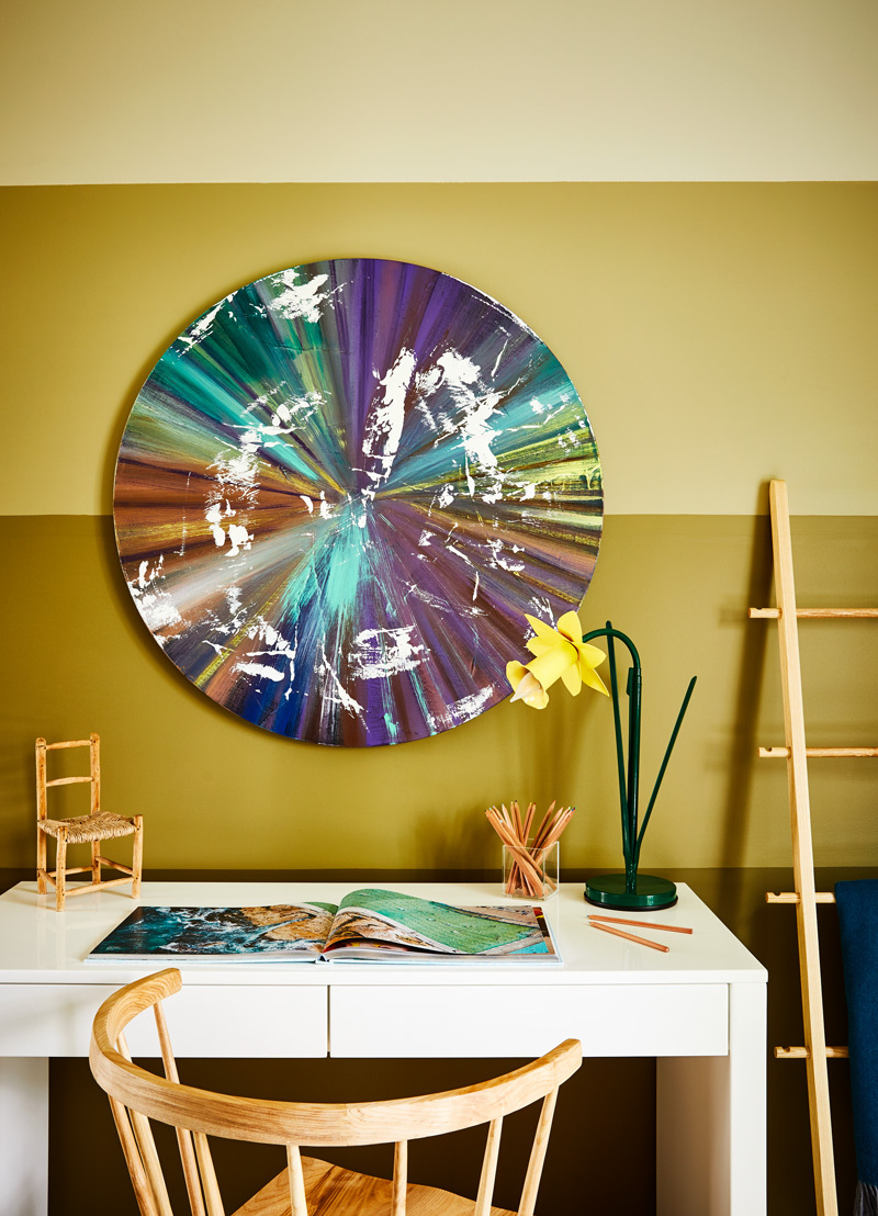
Of course, once a decision to paint (or repaint) in this way has been made, step one is to choose one interesting or unexpected hue to serve as the base. This year, we’ve all noticed increased interest in those borne from our relationship with the natural world: hunter’s green, terracotta, aquamarine, citron. That said, one need not be so restricted. Important conditions to consider: the amount and quality of natural light, as well as artificial light; any existing furniture or artworks that can be echoed in their color story; function. General preferences matter too.
Step two, unsurprisingly, is to then take it further: Choose a second color (or more, depending on the eventual scheme). For this phase, consider options that are either more neutral than the first, like an off-white, for balance, or try a different shade (or shades) of the same original color. Additionally, for the advanced eye, mixing in completely different hues is suitable as well.
Step three: Break the mold and create new paint boundaries completely independent of the existing edges of the room. Remember, simply painting the trim differently doesn’t count. Like most tasks in design, there are technically no rules, but guidelines commonly prove helpful.
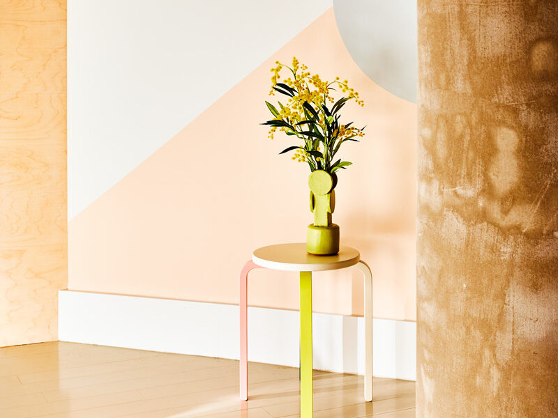
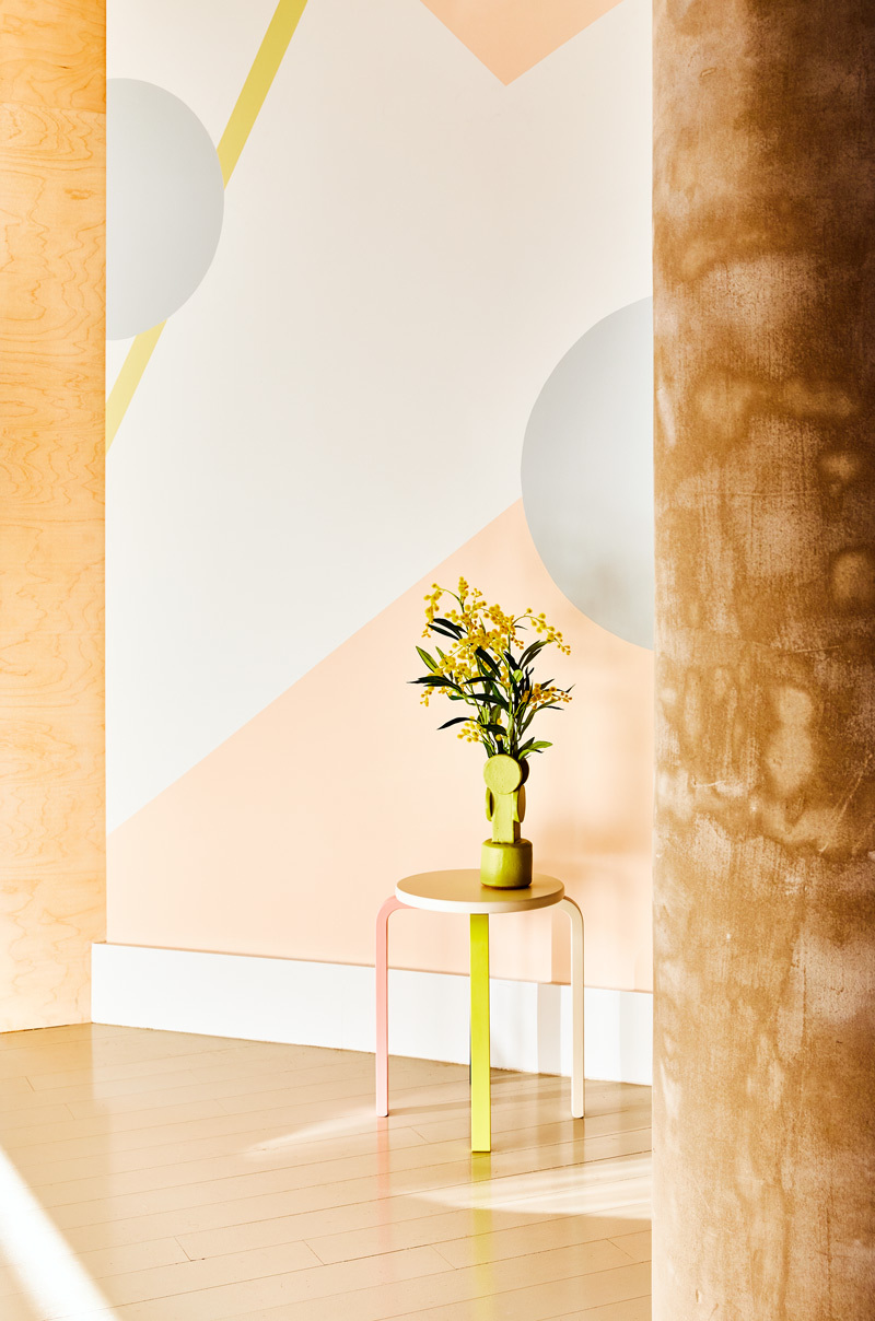
The first scheme that comes to mind is the partially painted wall. For this, there’s a predetermined imaginary line where everything below it is painted one color (typically, though not always, the darker one), and everything above it is painted another (typically the lighter one). There are no set rules, but this line is usually somewhere within the range of one third, one half or two-thirds “up” the height of the walls. (Two-thirds is a personal favorite.) This approach is incredibly potent in rooms blessed with high ceilings.
To have the greatest result, three things should be carefully considered.
The first is the line’s relationship with either an architectural or decorative element: for example, the halfway point of the window casings, or the edge of an artwork, mirror, or other wall hanging. By having an anchor for the paint line’s placement, there’s evidence of thoughtfulness and intention that creates an overall cohesion, which would otherwise be lost in its absence.
The second is ultimately a commitment to the cause. Everything needs to be painted above and below that line, including doors and trim. The ceiling should match the upper color; however, the floor can remain as is. That said, it is interesting, as an option, to explore a material that does coordinate with the lower paint portion, too. For example, a large area rug or even wall-to-wall carpeting that is similar in tone would amplify the overall effect.
The third relates mainly to contrast. The greater the difference between the two hues, the more intense the result. Oftentimes, this is the intention, and if so, by all means proceed. However, to add softness and sophistication, reduce the contrast to a reasonable minimum, while avoiding a shift so subtle it requires a surgical light to see.
Another scheme to consider is a gradient or ombré. This is when the colors change gradually from one end to the other; for example, from the bottom to the top. The overall outcome is similar in appearance to the fan decks sold by certain paint companies that many readers will know well. (And in fact, those decks are useful in selecting those very swatches as displayed for the gradient itself.)
Like the previous scheme, I usually recommend the darkest at the bottom and the lightest at the top. A more playful option than the previous, I tend to find success when using this in kids’ rooms, playrooms, or other youth-oriented spaces. Though for a contemporary and elevated space (think oceanfront study in a glassy estate on Dune Road), a professionally executed scheme could work quite well also.
Finally, there remain what are essentially simplified murals. Rather than duplicate a painstakingly crafted fresco from the 15th century, consider a vernacular interpretation of a minimal or modernist line drawing (seeking inspiration from the likes of Sol LeWitt or Henri Matisse), or even something as uncomplicated as a jagged mountain range with or without crisp white snow peaks. While no promises are being made in the ease of completing such a task, having fun is nearly guaranteed along the way.
More Posts from Andrew Bowen


